Get free articles like these right in your inbox.
Church Plant DIY Brand Plan Examples
DIY Brand Plan Examples
Great church planters have a keen sense of what it takes to engage people. In the early days of your church plant, you possess a heightened sense of how others perceive the church. You don’t have the budget to hire a branding specialist, PR firm, or marketing guru. You don’t have the stomach to produce ugly visual content. You cringe at what some churches deem acceptable for their branding, graphics, and visual material.
“
Great church planters know branding is important because they possess a keen sense of what it takes to engage people.
Church Planter Starter Kit
The challenge is real. You want your brand to engage the people you’re called to reach. But, you don’t have the…
- skills to be a designer
- time to micro-manage volunteer-led branding
So what can you do? You can follow my DIY Brand Plan. It is a simple plan to get you started on an engaging church plant brand. My plan helps your calendar, clarity and reach. The plan has 3 tasty ingredients. These are 3 ingredients you can use every day.
Examples of the DIY Brand Plan
Like any good recipe book, you want to see pictures illustrating the final dish. Here are some real-life examples to show you each of the 3 ingredients of my DIY Brand Plan in action. I’ll include an explanation so you know why the choices were made.
Review these. Get inspired. Then make your own brand plan! Plus, don’t miss my offer at the end of this article.
(Note: These examples are taken from churches and church planters I work with for Robby Fowler Design.)
Color Examples
Here are three examples of color palettes for three churches. Discover how each works to shape a brand and communicate the church’s vision.
Fellowship Paragould

Fellowship chose the bright colors of blue and green to represent life, growth and a sense of freshness. The complimentary browns give the brand color palette an earthy feel. When it all comes together, you have a blue sky, green plants, and rich brown soil. Not a bad metaphor for the life that Jesus brings.
Matthew’s Table

Matthew’s Table is a church plant near Chattanooga, TN. The orange, brown and stone gray color palette work well in two regards.
- Tennesseans love their Volunteers (University of Tennessee). The orange is a tip of the hat to a color near and dear to the people Matthew’s Table is called to reach.
- The vision of Matthew’s Table, taken from Matthew 9, is to see the broken people gathered around the table of Jesus. The color palette has a harvest, wood and stone feel. A perfect match of vision and color to carry the brand.
Midlothian Bible Church

Midlothian Bible Church recently underwent a vision renewal. A rebrand helped put a visual stamp on where Jesus is leading them next. Leaving behind the blues (the foundation of their previous color palette), the new palette communicates redemption (reds) and a welcoming warmth (coffee browns).
Color Summary
You can see how landing on a color palette begins to shape the brand of your church plant. Hitch your palette up to your vision and you are well on your way.
“
Church planters, I just learned how to hitch my color palette to my church plant vision. Check out http://bit.ly/cpsk1
Church Planter Starter Kit
Font Examples
Peter Piper picked a pair, and so should you. Look at these font-pairing examples from the same 3 churches.
Fellowship Fonts
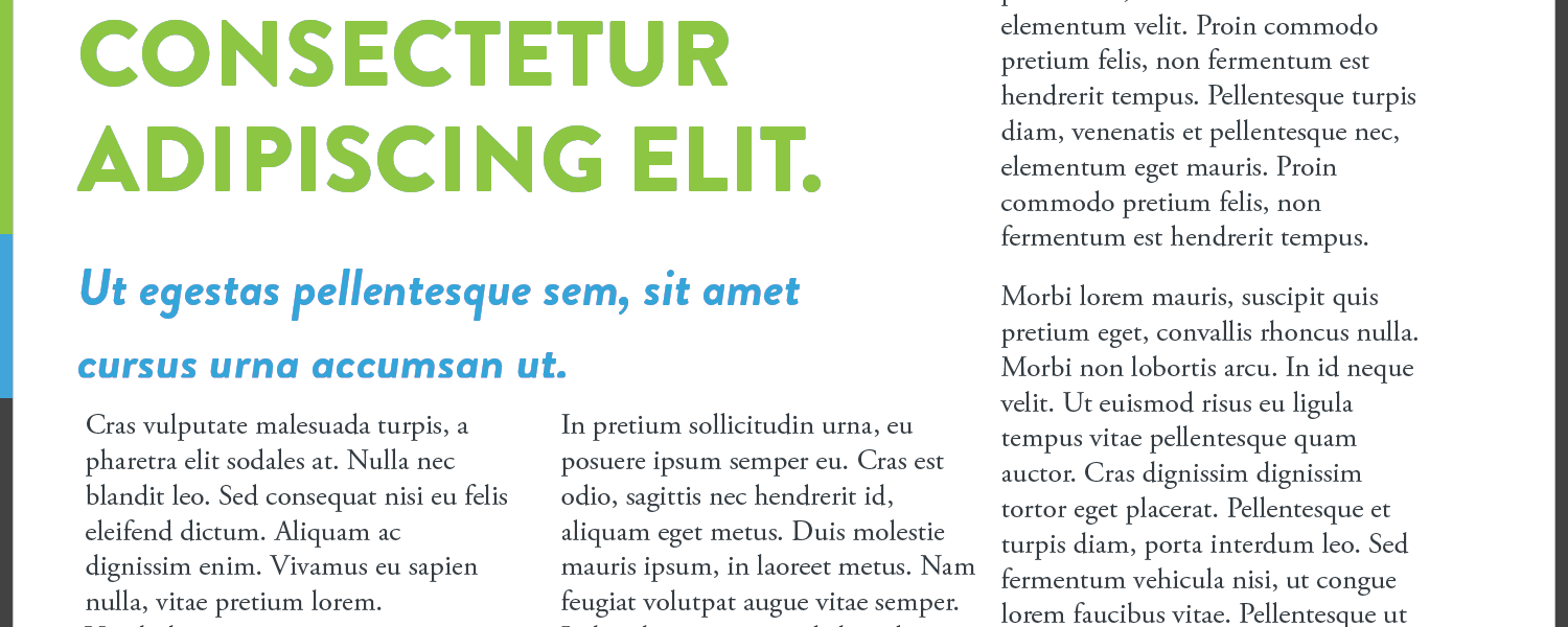
The main font for headings is a heavy san serif font called [Brandon Grotesque](http://www.hvdfonts.com/#6-Brandon Grotesque), also used in their logo mark. Fellowship uses the heavy weight called “black” for titles and headings and sets each heading level in a specific color from their color palette. The main text font for longer passages is a serif font called Adobe Garamond. The serif font is easy to read and works well with Brandon Grotesque.
Brandon Grotesque has a fresh look and a bit of whimsy. It doesn’t take itself too seriously. This matches well with Fellowship’s fresh, bright brand (see their color palette above). The serif Garamond font adds a bit of professional balance and tradition. This sense of tradition is important, as they are a newer church in a southern religious context.
Matthew’s Table Fonts
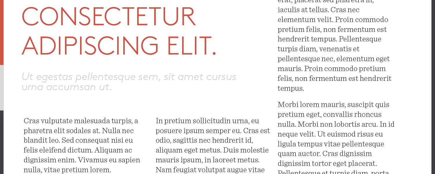
Church plant Matthew’s Table uses Brown for titles and headings. The light weight version of the font is clean, informal and approachable. When set in their orange, the text is catching and inviting.
Brown is paired with the serif face Sentinel. This modern serif font is not stuffy and adds to the overall approachable feel of Matthew’s Table brand and vision.
Midlothian Bible’s Fonts
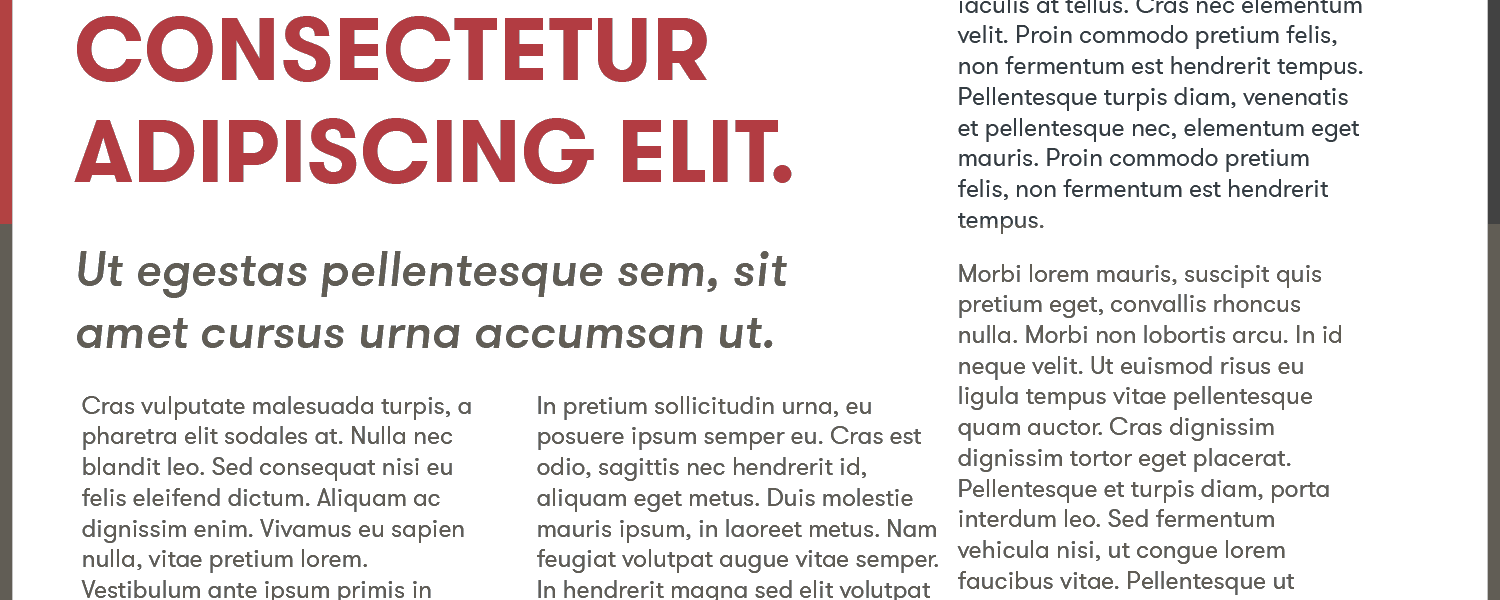
Midlothian pairs two different weights of a single font family called GT Walsheim. Titles and headings are set in a heavier weight of the san serif font while the main text is a “regular” weight version.
The unexpected characteristics of this san serif typeface make it a great match for Midlothian’s rebrand. GT Walsheim moves their brand towards a more modern feel. Yet the standout features of the font keep the text unique and distinguishable.
Font Summary
The font pairings for these church brands combine with their color palettes to help communicate vision. Over time, the consistency builds a recognizable brand for members and the community.
Images
The themes and colors of these images help each church tell her story. See how these images become a key third ingredient in a brand plan.
Fellowship Images

Fellowship uses muted images with brown and gray hues to balance the bright colors of their brand. Where appropriate, they will choose imagery around themes of growth, shepherd, and the outdoors. The theme and colors provide plenty of options and are easy to mute. The contrast of the muted images to logo mark works well and helps keep other colors from “bleeding” or competing with their brand.
Matthew’s Table Images

Matthew’s Table name and vision lend itself to a clear theme for images. Woods, tables, food and fellowship make it easy for the church plant to know what images to go with. Another bonus is the scenic setting of Chattanooga. Images of trees and the outdoors work well as a “natural” fit for their context.
Midlothian Bible Images

The color palette for Midlothian steers the images towards brown and coffee hues. The fresh vision and rebrand proclaim a strong desire to move outward towards their community. This new outlook lends itself to images of people, windows (transparency and openness), and building bridges to serve beyond the four walls of their building.
Summary
My DIY Brand Plan for church planters gives you a workable, manageable plan to get you started. If you follow this blueprint, you can start your church plant on some clear tracks. You won’t have to scratch your head every time you need a graphic, open Pages/Word or Google Docs, or design a newsletter for supporters.
You can start from day one using this plan. Or you can course correct now if you’ve gone buckshot with your church plant brand. My plan won’t cost you a dime. But it will save you some time.
My Offer to You Fierce Brand Plan DIYers
Give it a shot. If you run into a roadblock, or just want some feedback on where you’ve landed, shoot me an email or hit me up on [Twitter]( http://twitter.com/churchplantersk).