Get free articles like these right in your inbox.
#2 of 3 Technical Time Wasters for Church Planters (2 of 3)

Last time I dawned my Cap’n Obvious Hat and noted church planters are crunched for time. One of the most common time-wasters is usernames and passwords. Plant a church and you’ll have a million of them. Social media. Bank account. Domain name registrar. Web host. Email. On and on the list goes. Keeping track of them (or NOT keeping track of them) wastes time. So I proposed a simple, free solution so you can stop worrying about keeping or losing this critical information. Get the full scoop here.
Today we’ll turn our attention to the second of three common technical time wasters and how you can avoid it.
But first, let me start with an encouraging reminder. You have a bold, honorable calling. You’re entrusted with the best news on the planet, empowered by the Spirit, on behalf of the best person in the universe—Jesus. He’s made you and called you to follow him and lead others to be the church. Not a bad gig. And this is why you don’t want to unnecessarily waste time. So let’s get on with removing time-waster number two.
2 Time Waster: Starting from Scratch…over and over again.
When you start your church—or any new venture—you will do one thing over and over. Chances are, you will do this several times a day. You will draft a document. You will fire up Word, or Pages, or a Google Doc. You do it for small things and big things. You’ll draft things like…
- Leadership development docs
- A letter to the bank
- Church announcement
- Guest info sheet
- Small group material
- Children’s ministry handbook
I wish I could snap my fingers and say there is a pot of gold at the end of the rainbow with all of those documents already created. But I can’t. However, there is something you can do to save time every time you create one of those documents. Rather than starting from scratch with a blank document, create a template.
A template will save you save you time by removing decisions you have to make any time you create a document:
- fonts
- font sizes
- colors
- layout
- margins
- headers & footers
- logo
Built-in Templates Fall Short
Perhaps you’ve had an “important” document to write—so important that you dabbled into the templates that come with Word or Pages. If you have (like me), here’s what you may have noticed.
- You don’t always end up saving time. That’s because you can’t always figure out how to make your content fit the template. Your heading or content is too short or too long. Your photograph isn’t as compelling or coordinated as the template default. Either way, it just doesn’t add up.
- Your finished product doesn’t look like theirs. When you started the template looked like a great option. When you finish…well, not so much. You’re not sure where you went wrong, but there’s little time to fix it.
- You look like a stellar church-planter AND an award-winning designer. You navigated the template like an experienced pro. The only issue is those templates don’t necessarily match you. The other documents you created in the past or in the future don’t match. You end up with an outlier here or there.
Create Your Own Template
Create your own template as a simple, time-saving solution. Don’t be intimidated. I’m here to help. Here are some tips to creating a template you can use over and over again. But before I pass those along, here’s what one church planter said after I helped him create a template for his church. “We were talking the other day…the Pages template you created for us saves us so much time. I know it sounds crazy. But every time we go to create something, we can just start typing and know it will look like ‘us’.”
Template Examples
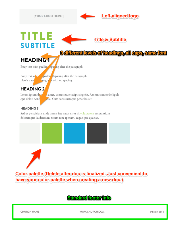
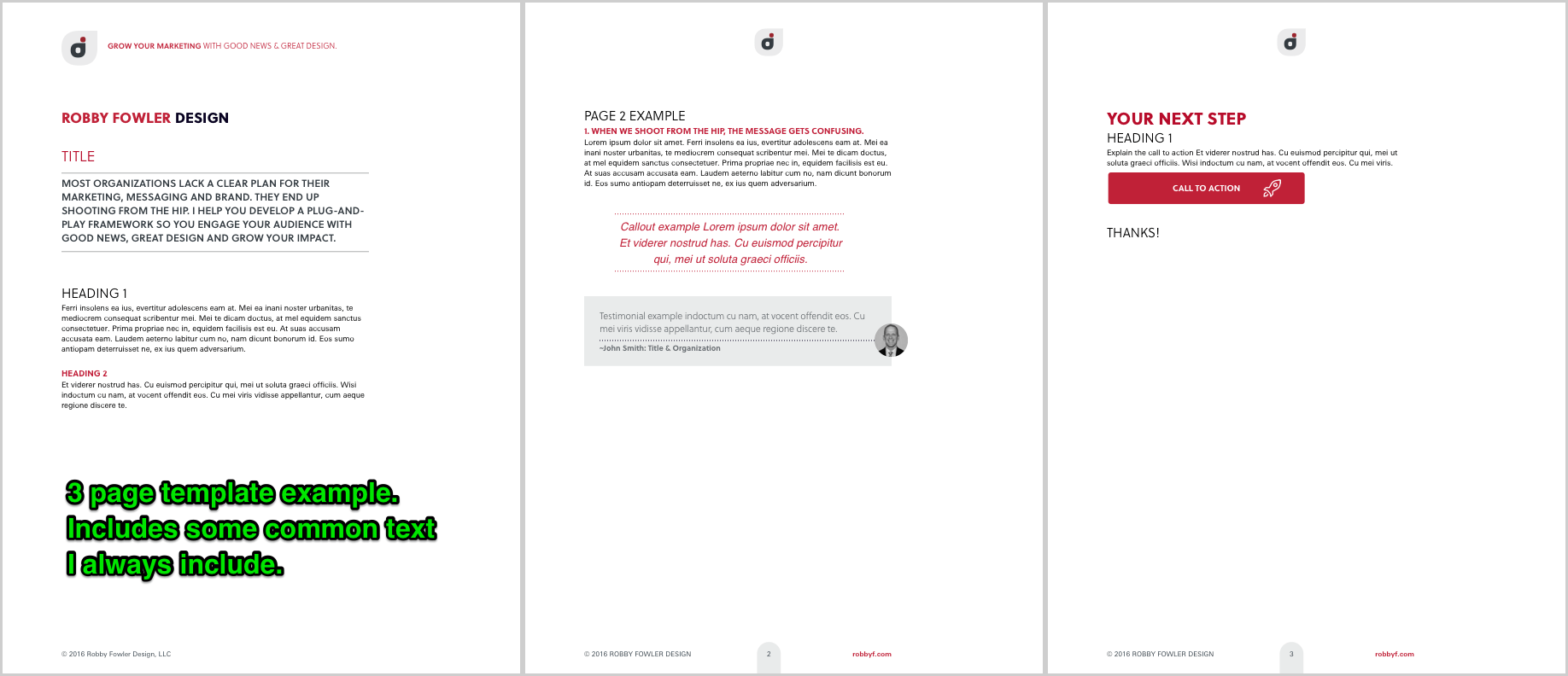
Here are two examples of templates. The first is a simple one-page template. The other is my template for Robby Fowler Design. It’s a 3-page template including common elements I use in almost every document I create. Download a PDF of each template to take a closer look.


Tips for Creating Your Own Template
- Include your logomark. Put it in the header of your document so it shows up on every page. Don’t make it too large (and braggadocios). You might center it, but it probably looks better visually aligned with the left or right margin. (Don’t get stuck centering everything.)
- Pick 2–3 colors based on your logo. Use the darkest color as the color of your main text. Use the other color for a heading. Use the third color as the color of any link in your document.
- Choose a combination of 2 fonts only. Here’s a great resource for the 40 Best Google Fonts…and Google fonts are free.
- Increase your margins from the default 1″ left & right. For the best reading experience, the average line length should be 45–90 characters (including spaces).
- Set at least 3 Heading levels. Choose a single font for your headings. Make the size difference between each heading level and between your main font-size overtly obvious. IE Don’t make Heading Level 1 18pt, Heading 2 16pt, Heading 3 14pt, and your main text 12pt. Go bold, go big, or go home. (Like 36pt, 24pt, 18pt).
- Add your basic contact info in the footer. IE Your website, phone, email, a copyright if appropriate, the name of your church, etc.
- Go to File > Save as template. (Or search the Help menu for how to save a document as a template in your software of choice.)
Summary
Save time by creating a document template. Make yours as simple or complex as you need. Then start with your template every time you create a new document for your church plant.